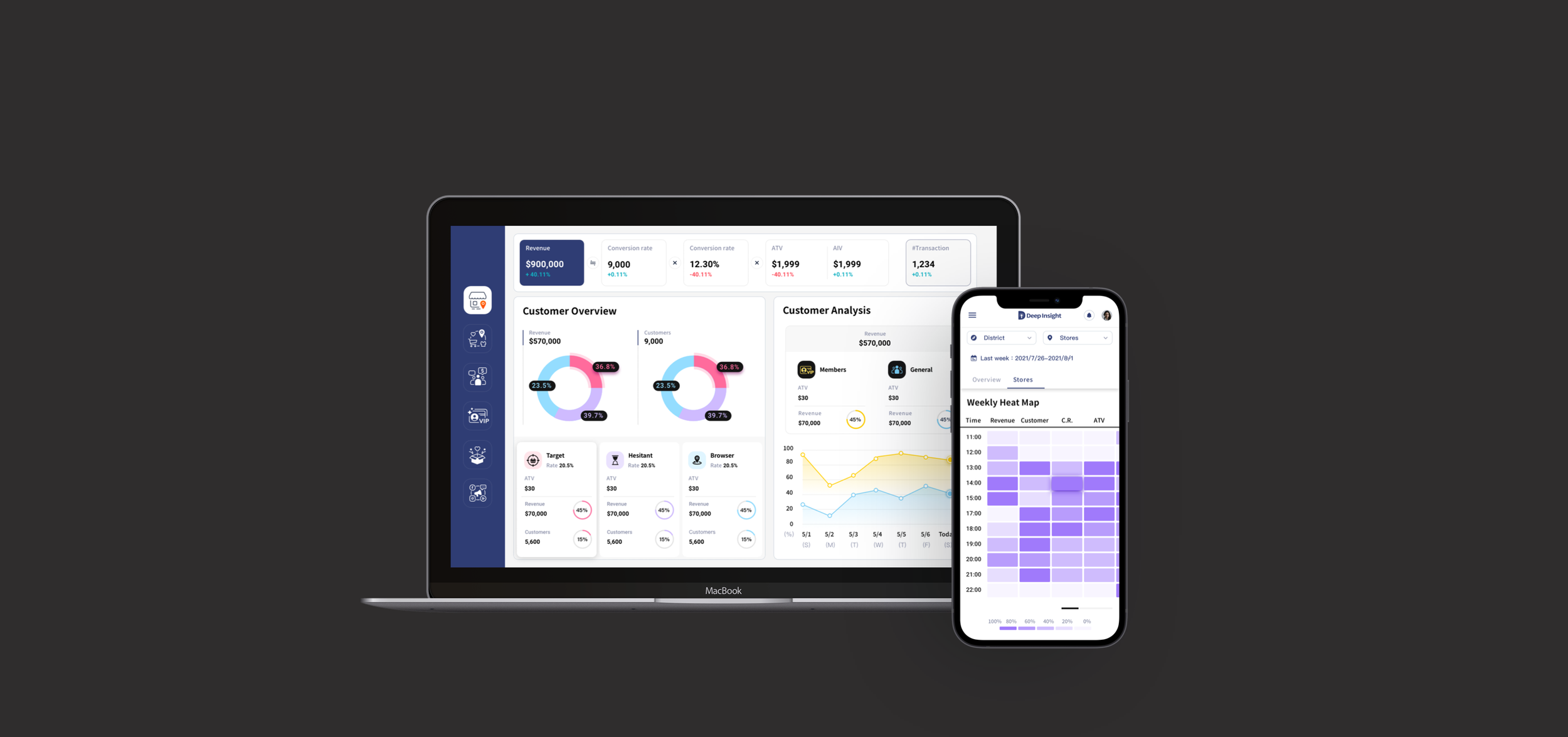
Data Dashboard for Retail
Role
Product Designer
Time
06.2021 - 08.2021 (3 months)
Produced by
Deep Insight Analytics co., ltd.
Skills
Data Visualization, Competitive Analysis, User Flow, Wireframing, UX Research, UI Design, Graphic Design
Tools
Sketch, Zeplin
Introduction
Deep Insight is a Taiwanese company that creates data solutions for retail businesses.
I worked with Deep Insight to create a retail data dashboard. I visualized footstep tracking data to map out and predict users’ shopping behavior, empowering retailers to maximize their revenue and optimize shoppers’ shopping experience at the same time.
My Role: I received the dashboard proposal from Deep Insight at the beginning. Then, I mapped out the user flow and drafted a wireframe to ensure my understanding of the project goal. After conducting user interviews and confirming the user flow and project objectives, I proceeded to design the overall visualization.
✍️ Design Process
💁 Who are the users?
1. Both desktop and mobile are important to this data dashboard.
According to personas, end-users use desktop and mobile devices to track daily data. The data charts should be displayed the same sets of data on both desktop and mobile screen sizes without discrepancies in interpretation.
2. The end-users have different authorization levels.
Because the end-users have different authorization levels, it’s important to take the absence of some elements into consideration. For example, if one of the charts is hidden to some users, the user interface should remain understandable and beautiful.
💁 How did I decide what to display on the homepage?
Given interview results, users think “Revenue” and “Customer demographics” information is relatively important to them for making business decisions. Therefore, I discussed with stakeholders and agreed to put these two pieces of information on the first page.
I visualized the following types of data information:
✍️ Design Ideation
Revenue Overview
Customer Demographics
⚡️ How did I design tables on mobile without losing their purposes and readability?
I performed competitive analysis on 5 competitors to know how they design data charts and data tables on desktop and mobile screens.
1. Some data charts should be transformed to another format.
Depending on the number of columns and rows, some data charts can’t be responsive. Transforming to a different format from Desktop is necessary.
2. Collapsed data table is fully responsive.
To design a data table with the collapsed column, users can swap to see all the data on mobile devices. Also, the primary column can be fixed in one place, so users can compare data easily.
Table design solution:
Given the findings from the competitive evaluation, I designed the following data table that is responsive across different platforms. When it comes to contemporary comparison, using collapsed data tables on mobile screens helps users to compare data efficiently.
Desktop
Mobile
🎨 Design System
I created a design system and style guide to help maintain consistency across the product. Users can find the systems familiar and easy to learn. (Increase learnability)
Design system can reduce developing redundancy and help future maintenance.
Menu icon
🤝 Due to non-disclosure agreement, I can only show part of my designs here. Please reach out to me personally if you have any questions regarding my work.


